Stardust in Retrograde

Starlight Sailors (Collegiate)
Senior Levels Designer, UI Designer
Jan 2024 – Apr 2024
Castor and Pollux, brothers born of falling stars, go on a journey to return the stars to the night sky.
This action-adventure features combat sections and light platforming. I was responsible for originally mapping out and blocking out a tutorial and two original levels, leading part-time level designers and set dressers, and overhauling all of the game’s menus and most of the in-game HUD.
Most notably, this project hired on designers four months into its eight month production time. The team had no design-infrastructure, forcing disciplines to work extremely close to one-another.
Level Design
Responsibilities:
- Three brand-new levels.
- Paper maps for review.
- Whitebox using UE5 modeling suite.
- Direct collaboration with artists to develop an environment kit and set-pieces.
- Led a team of set-dressers.
- Overhauled tutorial sequence.
Pre-Production
Starting Point
Temporary level with no plans to ship.
Objective
Create three (originally four) brand new levels, help expand the environment kit, and directly establish a consistent engagement type.
I started out by syncing with designers on important gameplay and narrative beats.
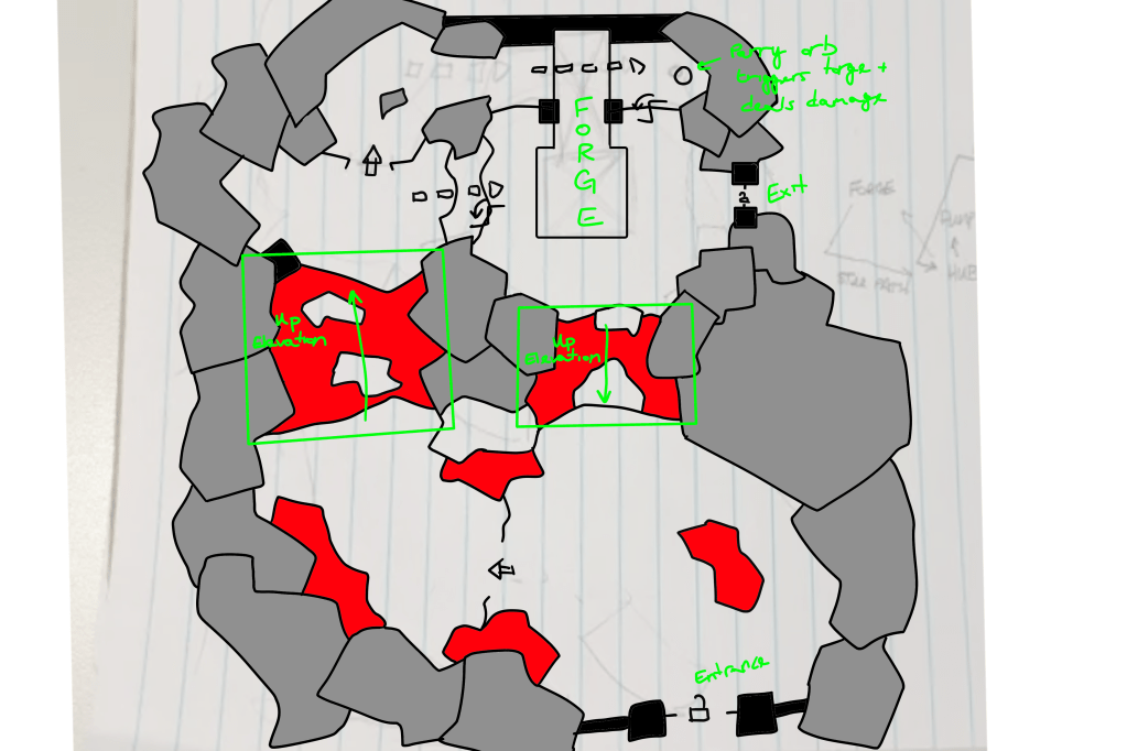
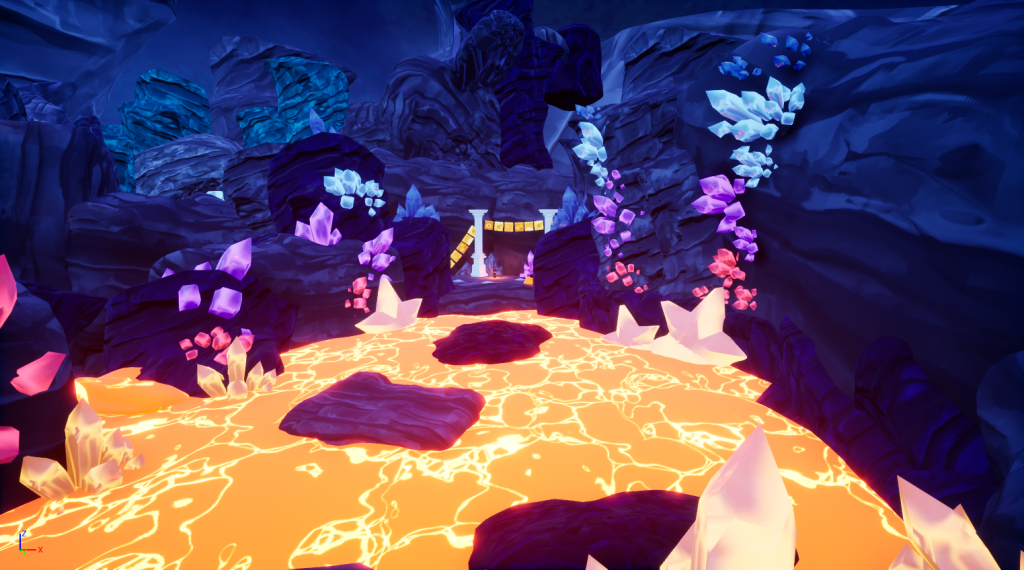
- The creative director and I settled on individual “biomes” for each level — a tutorial in a snowy canyon, a frozen waterfall, a pump, and a forge.
- In the center of the world map, a central hub for players to return to. This ultimately became an observatory with a magical telescope.
- Levels needed to feature smaller combat and platforming encounters, plus a mini-boss encounter. Platforming was later scoped out of production.
- The system designer requested that levels be designed circularly with a lot of spiraling; this was later scoped out of production, but traces of this concept are evident in the levels that were shipped.
- To instill a strong sense of wonder in the player, we wanted big, sweeping vistas during combat downtime.
Following this, I got to work on drawing maps for each of the levels. Rough sketches of each map were created with paper and pencil, before being photographed and traced over in Krita for clarity and easy editing.


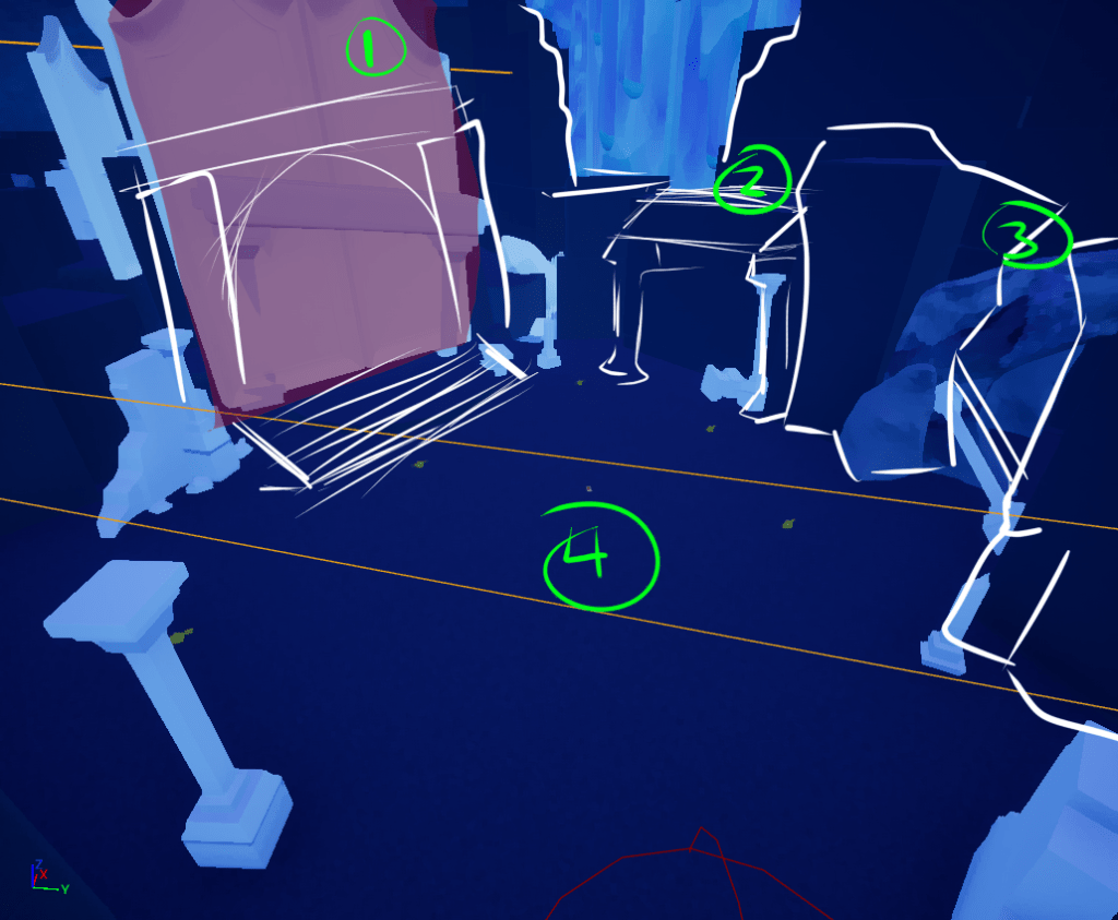
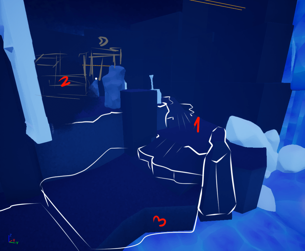
Whitebox Phase
I was responsible for nearly all of the in-engine whiteboxing of the levels, either independently or leading a strike time.
- Whiteboxing was done using the UE5 modeling toolkit in-engine. All whiteboxes were made in their own sub-levels, which allowed us to avoid breaking the build with new content.
- In theory the design team would have four months to work; in practice, designers needed to have whiteboxes finalized in about 6 weeks to allot time for set dressing, lighting, QA, and post-production touches.
Big Changes
While whiteboxing, some miscommunications occurred and we made the levels too large in scale. I spent a lot of time bringing it back to the right scale; since then, I’ve been careful to document my scale clearly and size areas conservatively.


Additionally, I opted to try sketching over different sections of the whitebox in Krita; this was to put all departments on the same page about how certain areas should look. I would eventually adopt this into my workflow whenever production would permit it.
Dressing and Other Passes
After cementing the whiteboxes for the alpha release, I transitioned to an supervisory role on levels (the team needed me elsewhere in this stage).
- I led a team of set-dressers as we introduced the environment kit to the level.
- Meanwhile, other task forces for audio, lighting, enemy behavior, and QA were also working in-level. Communication across departments was mission critical, and we had to be extremely diligent in our file management and versioning.


Next Steps
Another four months of production were scheduled, but restructuring in other projects required us to merge with another team, adopting their project. Production on Stardust is on indefinite hiatus, with intentions to resume in the near future.
In the meantime, the team has concrete plans on what comes next for the game. For level design, another iteration would bring the levels to a much higher degree of quality — primarily by targeting certain sections that are simply too long or too large.
- A “quick return” to hub after completing a level.
- Massively shortened transitions between levels.
- Simple progression mechanisms in each level, tied directly to their unique set pieces (i.e., unfreezing the waterfall, activating the star pump, etc.).
- Platforming-focused sections between encounters to better pace the player.
- Mini-boss variants built on the existing mini-boss AI and move set.
Interface
Responsibilities:
- Globally rework the interface visual style.
- Design and spearhead an implementation team for a new in-game HUD.
- Rework and spearhead an implementation team for an overhauled main, pause, and settings menu.
HUD Design
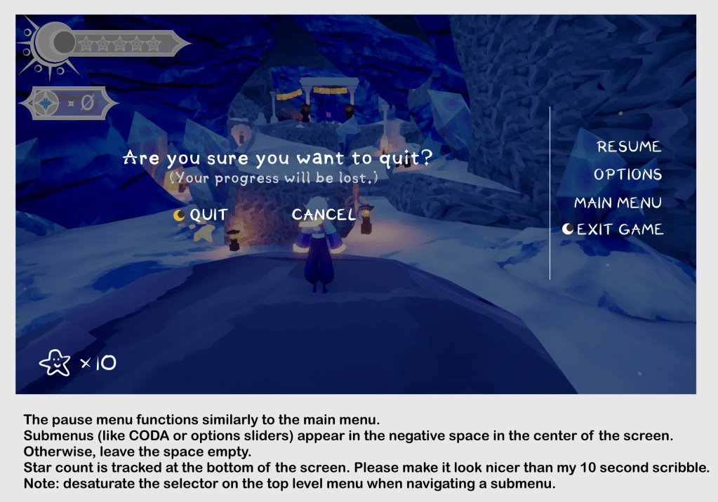
Stardust is all about wonder and heroism — as such, my first priority was clear the screen as much as possible to soak in the environment. In practice, this takes two forms:
- Creating “hideaway” elements — pop-ups that appear on screen when relevant, then disappear when no longer needed.
- Reducing visual weight; I championed the idea simplifying UI elements into more geometric forms, with the intention of not drawing the player’s attention away from the world around them.

Menu Design
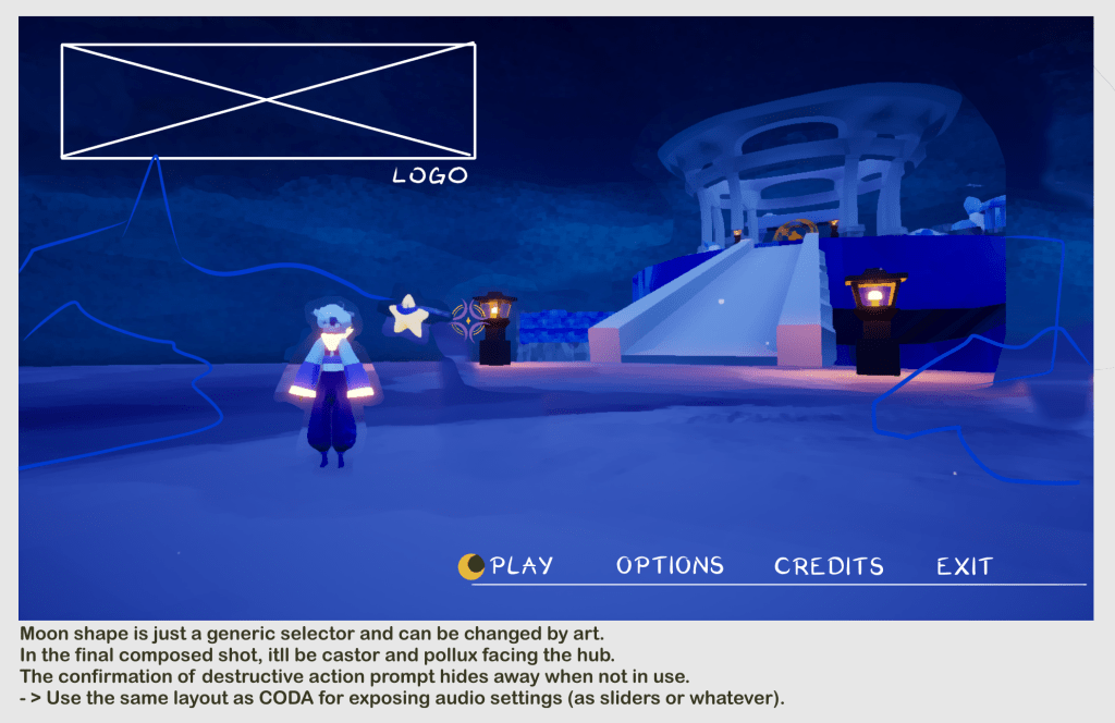
I designed the menus to reflect the same values as the in-game HUD — primarily, creating as much space to view the world as possible. This took two forms in the menu designs:
- Translucent backgrounds allow the player to see the world paused behind it, allowing them that extra moment to admire its beauty even while time is stopped.
- Menu elements hug the outer edges of the screen; this saves space in the center of the screen, where the in-world composition is likely most interesting.
Postmortem
This project is where I found my stride with my UI workflow. Combining in-game screenshots with markup in a drawing app struck the right balance of getting ideas on paper without being bogged down by creating context. As for the results of the project — I feel that the work that I did was effective and elegant, especially in how I respected our target engagement types. Some of the proposed UI did not get implemented in time for the pre-alpha build; when I get a chance to revisit this project, the remaining UI implementation is a high priority.
