Knight Light
Somninauts (Collegiate)
Design producer, level designer, interface designer
Aug 2024 – Dec 2024
As nightmares manifest lay siege to a sleeping city, their fierce protector — the Knight Light — awakens to protect them.
This action-adventure features primarily 3rd-person combat and point defense mechanics. As design producer, I hired and managed the design team, and regularly audited our progress. I also reworked most UI in the game and created one of three levels, from paper to engine.
This project was adopted by our team eight months into its twelve month development period. I co-led the design team and assumed administrative duties as department producer on top of my usual design role. The project needed significant codebase and design restructuring at the time we joined; despite the rigorous timeline, designers were able to deliver our department objectives before ship.
Interface
Responsibilities:
- Take an active role in the UI task force for cross-discipline implementation.
- Redesign and wireframe in-game HUD for health and mana.
- Redesign and wireframe the UI for various game-states, like loading or game-over.
- Overhaul UI for the upgrades system in-game.
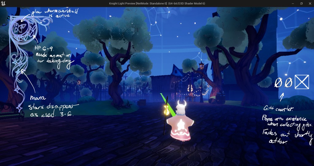
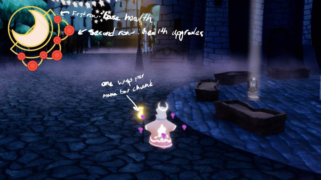
HUD
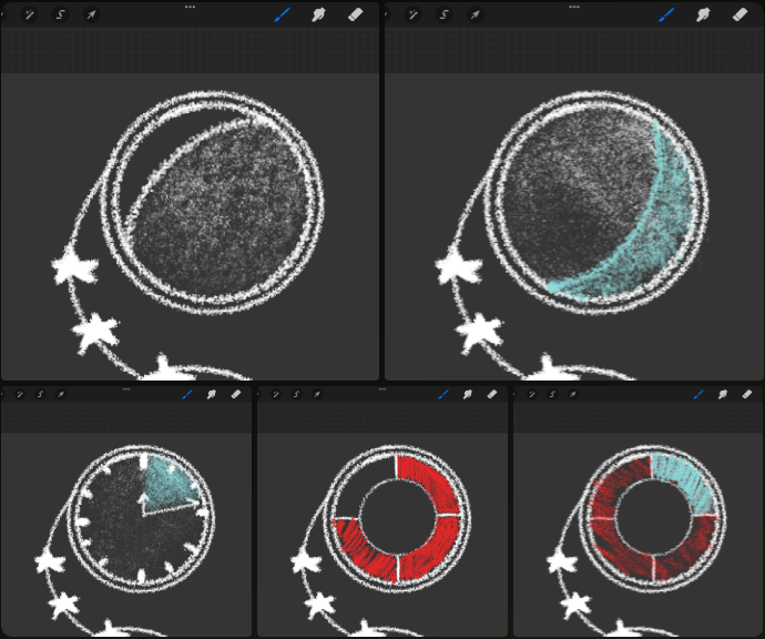
Knight Light has mechanics for HP and mana; beyond that, we wanted the HUD to be as bright and ethereal as Ptolemy. We went through several iterations of the design, experimenting with Victorian-style ornamentation and painterly strokes and colors. Ultimately, we settled on the crescent moon design, using winding tendrils to visually anchor the element to the screen.
- In the plans of the upgrades menu, there were supposed to be passives which would also be tracked on the HUD. Gifts were supposed to act like currency, which also needed to be tracked. You can see some of these considerations in the wireframes below.
- Drop shadow is a really easy addition that I campaigned for during implementation. It was vital that the UI stands out from the background, and to do this, we could create artificial depth by adding a shadow behind the element.
- For sketching, I used Procreate to visually test different motifs. For wireframing, I used Affinity Photo 2 to kitbash and draw over in-engine screenshots.
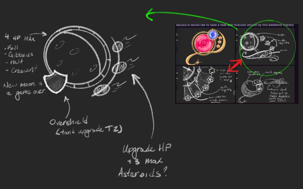
Miscellaneous sketches and wireframes from the design process. We experimented with various motifs pertaining to Ptolemy’s symbology and major landmarks in the level. Originally, I wanted to remove the UI for mana and replace it with in-world wisps which orbit Ptolemy; this was later cut due to art budget.
Game States
When I joined the project, I identified that redesigning transitory screens (the game over and loading states) would be the most efficient step towards immersing our players at every step of the experience. My core principle for these designs was to heavily limit the need for text — anything more than a couple words was too much; this would help us engage the player at a sub-cognitive level and relax them into a dream-like flow state. Instead of text, I wanted movement and visuals to tell a story.
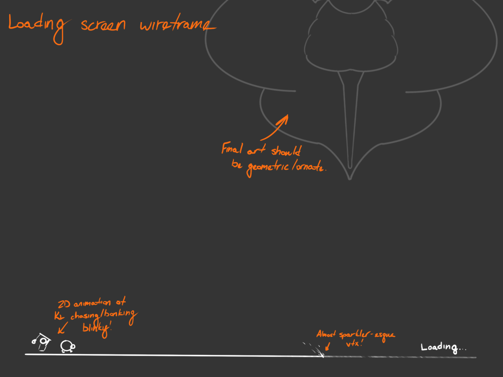
Due to production constraints, we weren’t able to implement my proposal for a more thematic game over menu. However, I was still able to implement a level sequence for the “death” event (game overs caused by player health reaching 0).
Mechanics
Responsibilities:
- Conduct a design audit upon joining the project, compiling a list of high-profile design issues.
- Reinvent the point-defense mechanics to build a stronger foundation for gameplay.
- Create an ASFs document which could be referenced by every department.
Mechanics
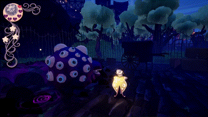
Early in the project, I took charge of evaluating the game’s design progress. By playing through the game multiple times, I compiled a list of major pain points the design team would absolutely need to address to put the game in a good shape. The biggest problem I identified was a fundamentally broken point-defense mechanic; monsters would spawn from points near the edges of the map, then attempt to destroy windows also at the edges of the map. Over the course of two weeks, I overhauled the mechanic around a new defense object — hanging wards called witch balls.
- Now, enemies would spawn at the edges of the map, and converge towards a central defense point. This employed more of the arena, as the enemies (and thus the player) have more reasons cross the center of the map.
- Witch balls also reduced cognitive load on the player. Since there were less points to keep an eye on, the player could invest more of their attention in combat.
- I developed a series of design rules, ASFs, and other implementation details in a document called the Combat-Level Mechanics doc. This was color-coded to help task forces identify information pertinent to them.
Level Design
Responsibilities:
- One of three levels, from concept to completion.
- Paper maps for greenlight.
- Whitebox spaces using UE5 modeling suite.
- Overhaul global mechanics for encounters.
- Co-design world map and transition spaces.
- Design point-of-contact during set-dressing and lighting passes.
Starting Point
One level, shipped with pre-alpha demo.
Objective
One of three original levels to replace the pre-alpha level, complete with a boss arena and other functional elements. In-level mechanics (guarding “defense points) need updated globally.
Early in the project, I worked with my fellow level designer and leadership to build out a plan of attack. The conclusion that we came to was that the level we inherited was not salvageable due to it’s non-linear shape, and that the best course of action would be to re-imagine the level as a linear experience.
- When roughing out a world map, I championed the idea of moving up in elevation. As the player progresses mechanically, it was important to me that they are physically climbing higher to build a consistent spatial language.
- The original level featured an unsuccessful wave-defense mechanic. I took charge of the mechanic, giving it a fresh redesign and leading the implementation effort across multiple departments.
- I created the “Combat-Level Mechanics” document, which details all high-level information about reworking the level. This included ASFs across all disciplines, as well as a standardized set of rules for how levels should be laid out to facilitate gameplay.
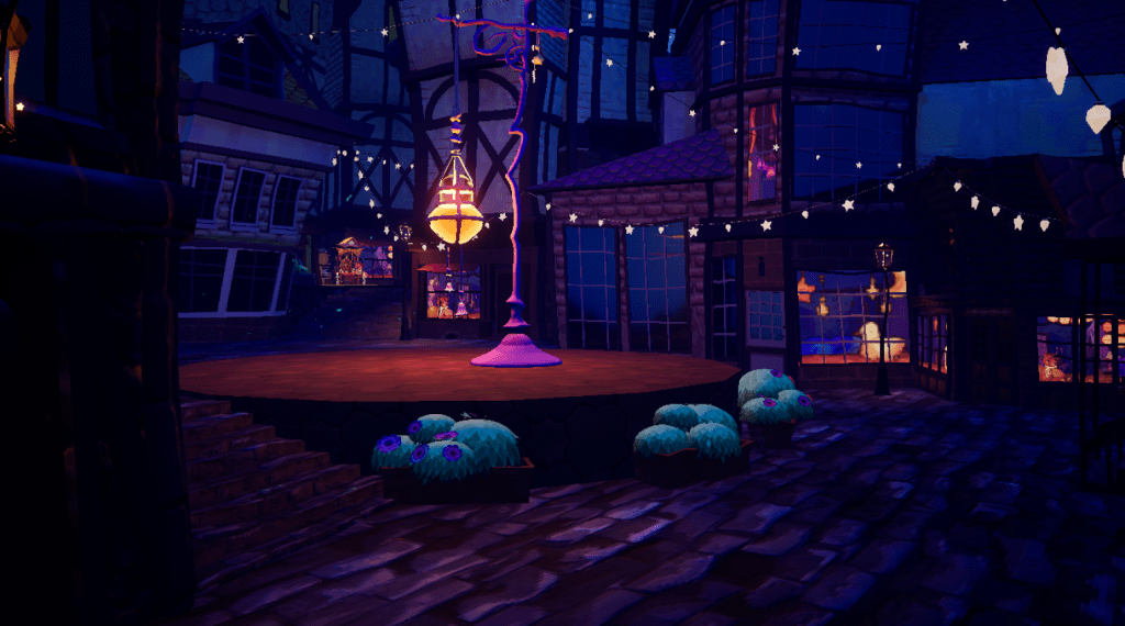
Level 3
I elected to take charge of the third level. Importantly, I would only have about a week-and-a-half to design, build, and dress the level before moving on. Given the timeline, I narrowed my focus on two principles: (i) creating long sight lines to see the final witch-ball from multiple locations in the level, and (ii) creating narrow paths for traversal to invoke an urban feeling in the space.
- I created my paper maps in Procreate. I took screenshots of the level in-editor to draw on, helping me maintain the size and shape-language of the other levels. I split up this task between the two combat arenas, largely to facilitate iterations on sizing.
- During this, I asked for feedback from the design department and those in other roles. I found that the level was feeling slightly small, prompting me to increase the size of the arenas by a significant margin.
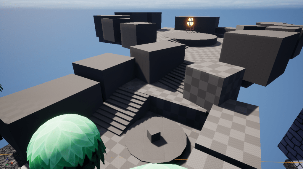
- I built the whitebox in the UE5 modeling suite in-engine. The cube grid tool was massively helpful during this time, allowing me to quickly block in and adjust the size of areas without directly editing faces.
- For set dressing, I was assisted by a team of specialized set dressers in bringing the level to life using a freshly updated environment kit. During this section, we discovered that due to the sheer size of our building assets, it wouldn’t be possible to keep sight lines as clear as I had originally planned; I compensated for this by campaigning for a bigger final witch-ball and lighting that could be seen over the buildings.

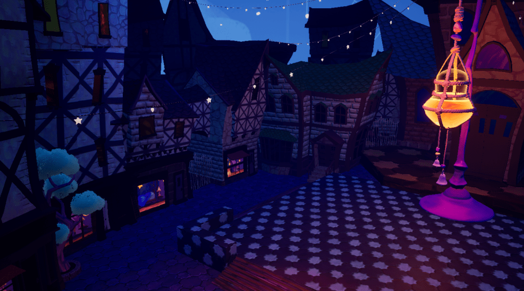
Screenshots of the final level.
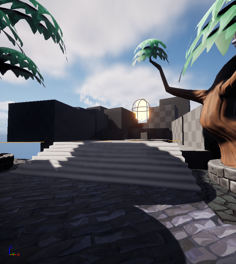
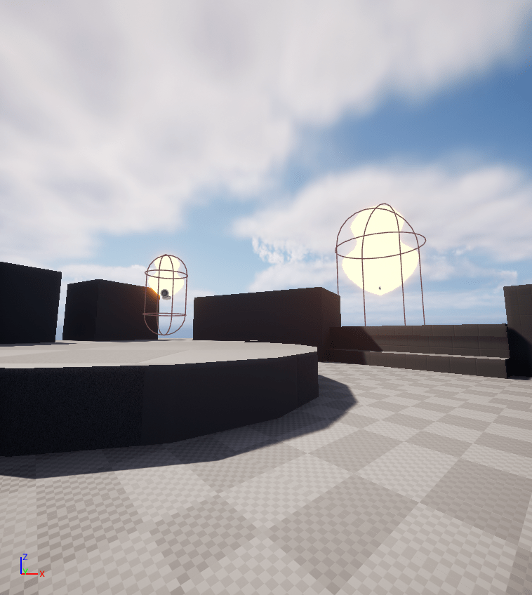
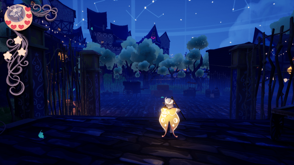
Screenshots I shared with the team, advocating for long sight lines to the final witch-ball.
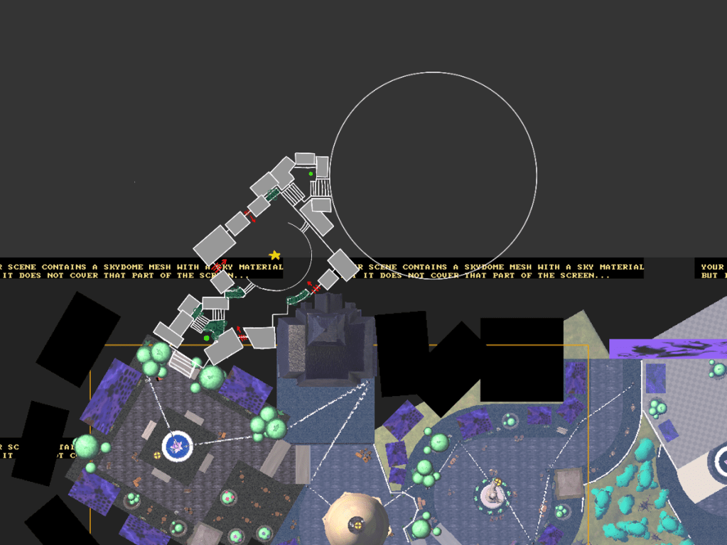
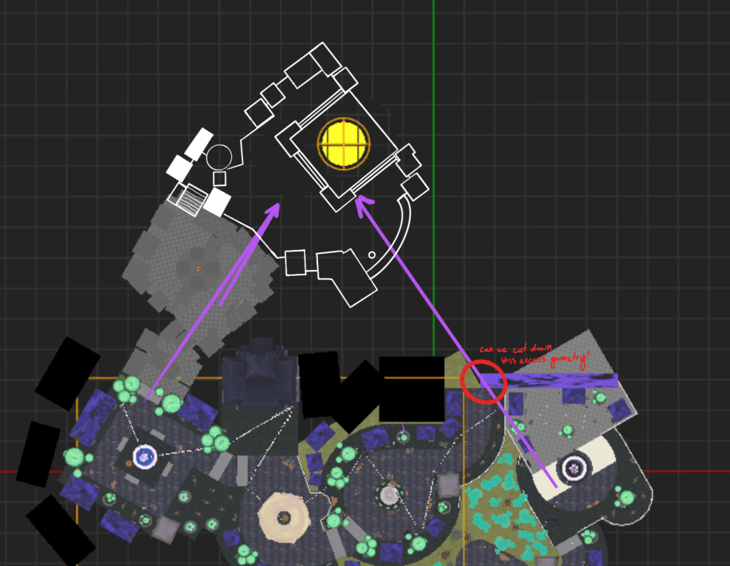
Paper maps for the level, drawn in Procreate over in-engine screenshots.
