Dead Cells: Wayfarer FU
Solo
Oct 2024
The Beheaded needs a better map. Or do they?
This concept for an unofficial update to the hit game Dead Cells pitches and update to the in-game mini-map and navigation gameplay loop, as well as an alternative pivot for the update.
Original Rework
OBJECTIVE
Design and pitch an update to the existing UI systems in the game Dead Cells.

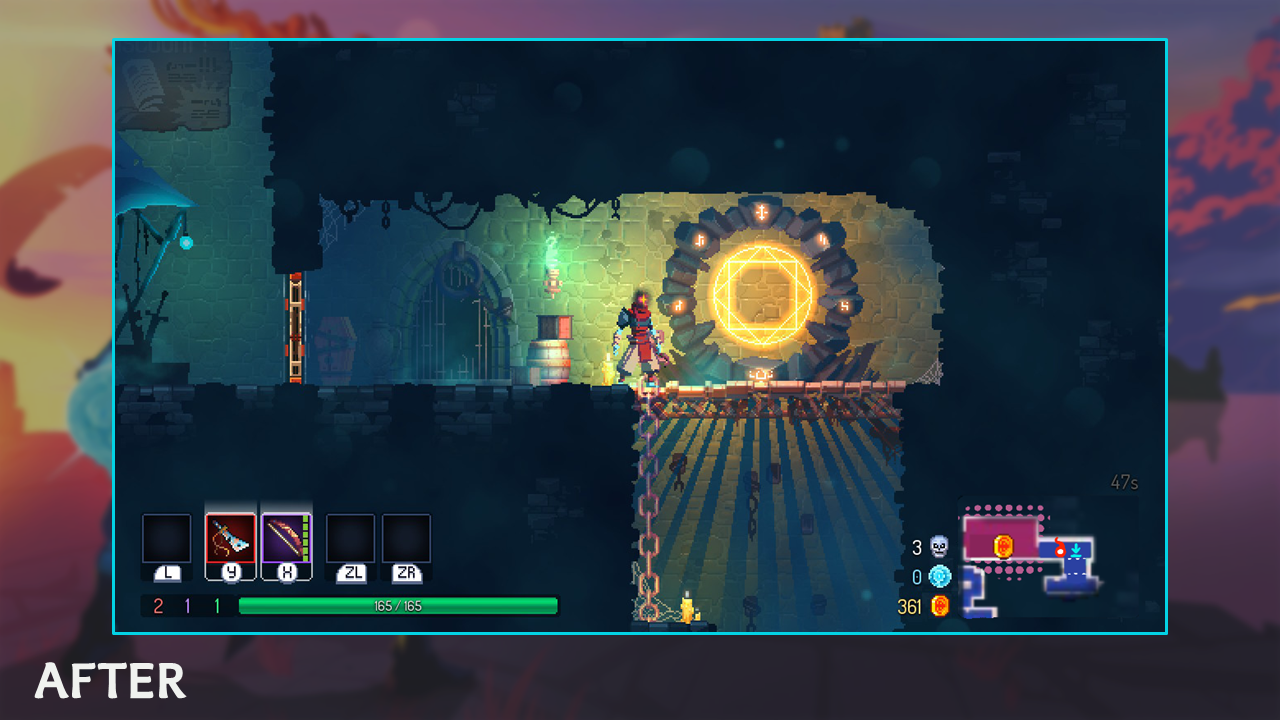
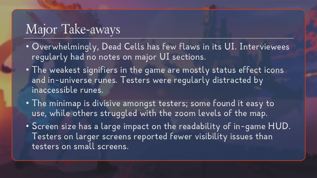
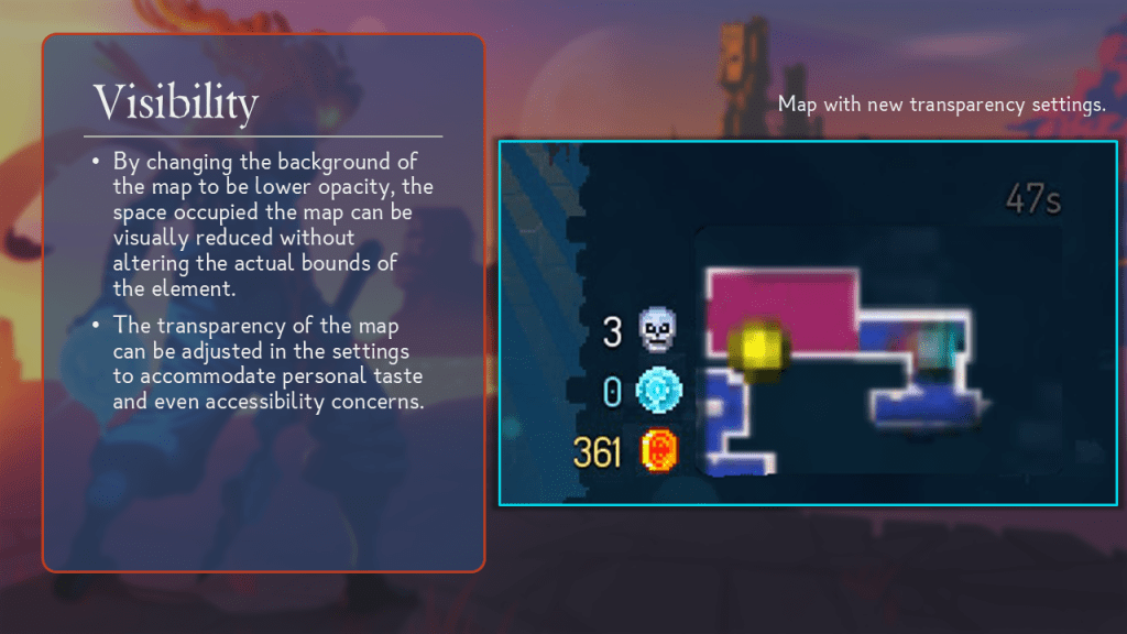
Based on user testing, this update focuses on the navigational systems and their related UIs, especially the mini-map. The most important aspect of this initial redesign was to improve clarity and accessibility in the mini-map.
i. User Testing
Before delving into any design work, I started by gathering data from potential users. Testing involved an entrance demographics survey, a live playtest with observational notes, and an exit qualitative interview about their experience.
[OneDrive — Preview sample playtest document.]
Users were issued certain data privacy rights that prevents me from publishing their data. The sample document above has all data redacted from it.
ii. Apply Testing Data
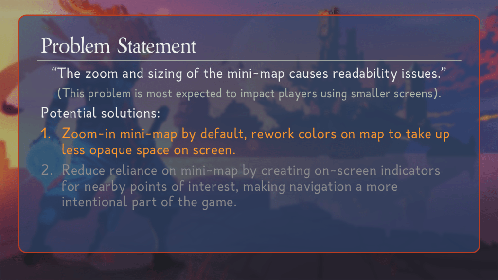
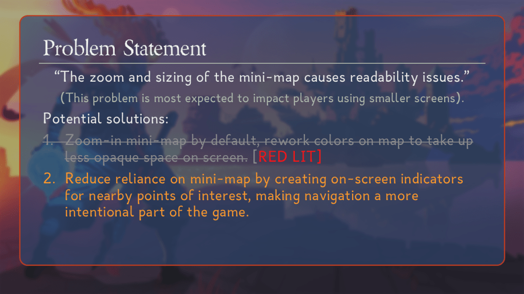
The goal of using the tester data is to find points of friction in their experience. Testers responded positively to the UI across the board, save for the mini-map element; testers reported grievance with the zoom level and size of the mini-map. This allows us to narrow down to a problem statement, from which we can start considering solutions.
iii. Develop Solutions
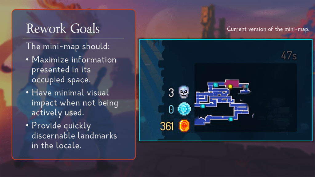
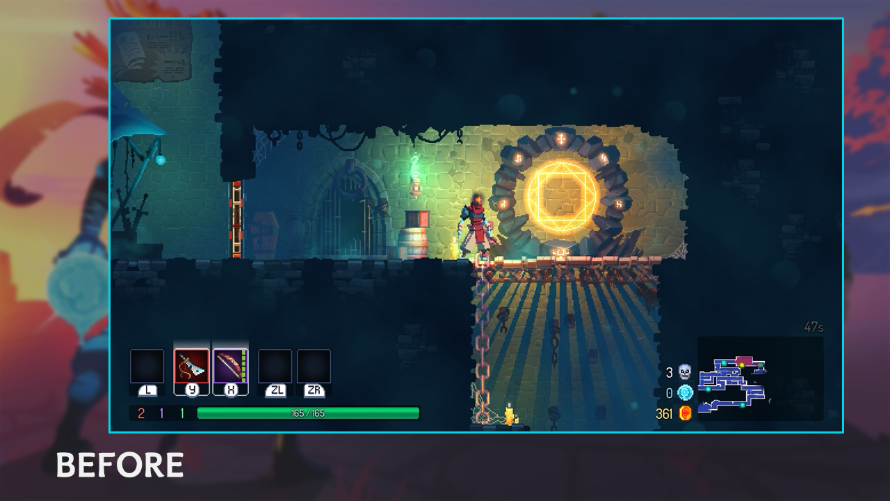
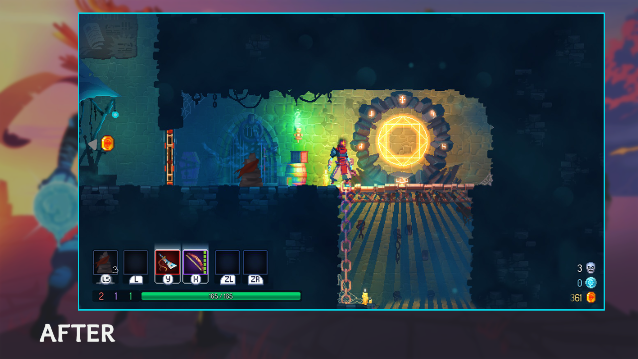
When designing this update, I took the approach of tackling the solution in layers. I laid out a series of goals for each layer, and then applied it to a visualization of the element. I used Affinity Photo to kit-bash the wireframe over screenshots.


iv. Implementation
At that point, my proposal could’ve been greenlit by leadership, and we would move on to implementation. Dead Cells‘s current modding support does not allow UI changes, so for this project, we will settle for what-ifs.
Pivoted Rework
OBJECTIVE
Design and pitch a drastic pivot from the proposed update.
For this exercise, I assume that my proposal above is declined in favor of a more systems-forward approach to the navigation gameplay sub-loop.
The design consideration that ties this whole pivot together is being faithful to the game’s design pillars. Motion Twin has stated that challenge is a deliberate part of the game; the game toes a delicate line of being difficult enough to be engaging but accessible enough that anyone can do it. I intentionally carried those sentiments into my design for this pivot.
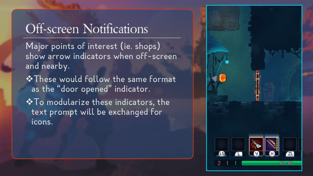
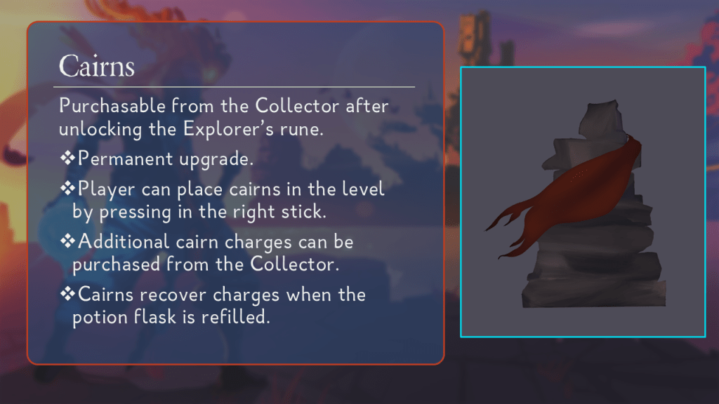
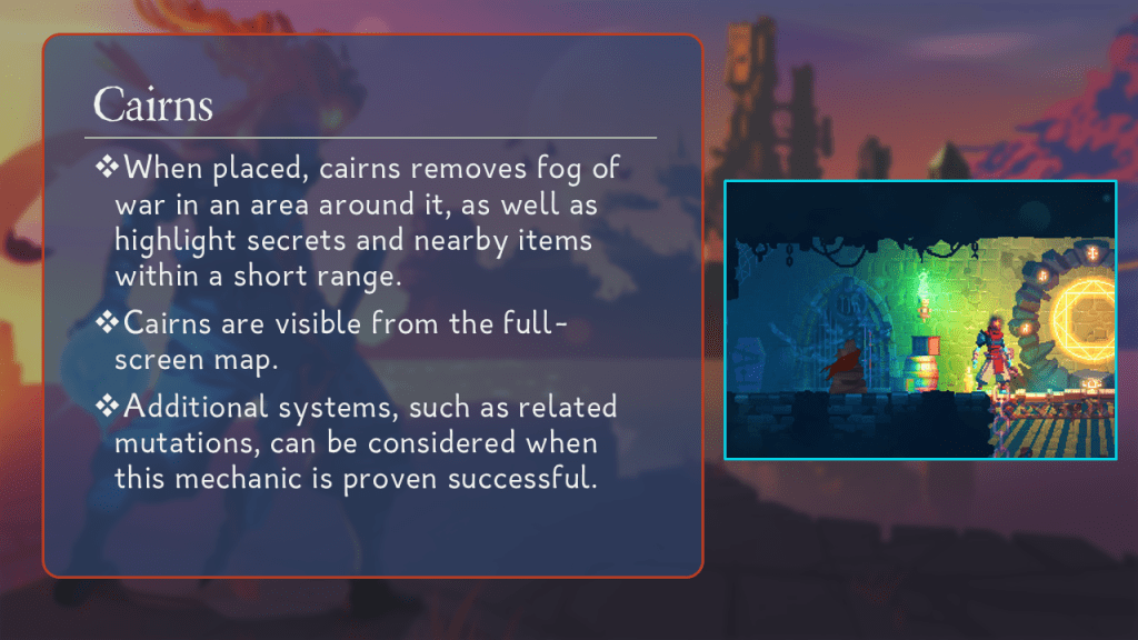
I took a two-pronged approach. I reduced the importance of the mini-map by recycling an existing UI element — off-screen indicators (usually used for switches). Then, I added a new deployable as part of the player’s toolkit; cairns allow the player to place persistent markers in the world to mark points of interest and clear fog of war.